JS Viewport
On a recent project, unfortunately we had to add some device specific JavaScript. There were some elements that were present on mobile and not on desktop, which needed to have some JavaScript applied to them. I say it’s unfortunate because it wasn’t a nice feeling having to do this (we typically don’t want to write any code for special circumstances).
One of the main issues with existing responsive checking JS libraries, is that they only seemed to check mobile vs. desktop, and the way they were determining this was by looking at the device browser. We didn’t think this was a great way to do this, as it shouldn’t matter which device the user is using, but the screen size.
Another popular solution seems to be checking the screen size in JS:
if (window.screen.width >= 768) {
  // Do tablet things
}
This would work, but we wanted to be more DRY (Don’t Repeat Yourself) about the solution. We were already using breakpoints for mobile, tablet, and desktop in our CSS, so we wanted to use these values in our JS so that if we change our breakpoints we wouldn’t need to remember to change the JS as well.
What I came up with was JS Viewport.
Check out the README to see how to use it, but I wanted to quickly go through how it works.
Responsive content
There’s a CSS property called content which allows you to output characters
inside the selector. For example:
#example {
  content: "Hello, world!";
}
Any element that has the id example would contain the string "Hello,
world!". The good thing about this is that the string is not visible, unless
you use the :before pseudo selector. You can get access to this CSS property
in JS relatively easily:
var element = document.getElementById("example");
window.getComputedStyle(element).content; // "Hello, world!"
The bit that makes this interesting is when you apply media queries to the
element, changing the content value:
@media screen and (min-width: 768px) {
  #example {
    content: "I'm a tablet!";
  }
}
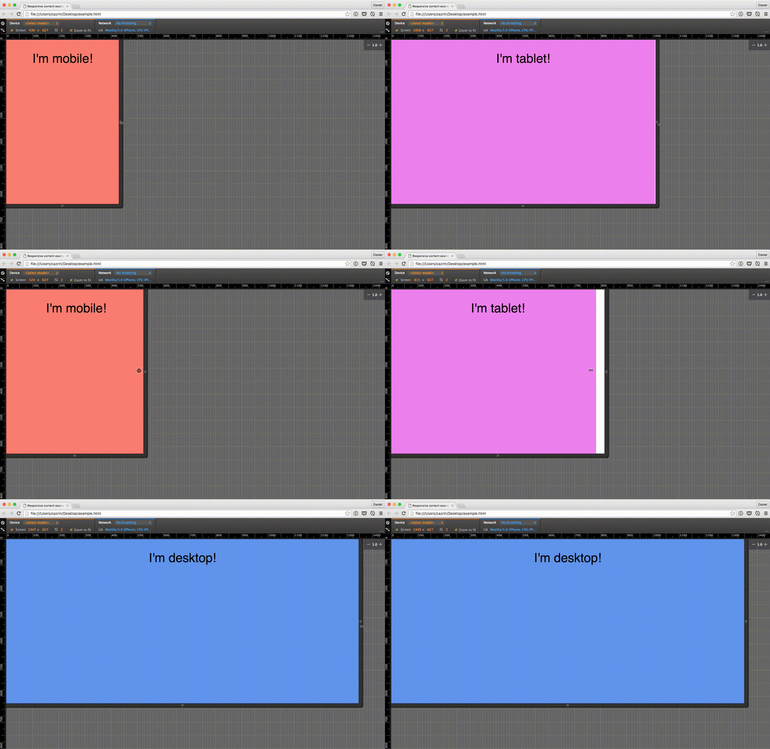
If you configure your media queries on the element to use your CSS breakpoints, depending on which media query is applied, the content of the element will change. Now, when you use your JS to access the element’s content property, you can tell which breakpoint is active in JS. Here’s an illustration of changing the content property through media queries:

In a real use case, you will want to make this element invisible so that it isn’t displayed to the user.
Conclusion
I don’t think this problem comes up very often, but it’s always nice to have a solution in mind. If you find it useful, I have some ideas of how the library can be improved, and would appreciate any contributions.